UX / UI Designer
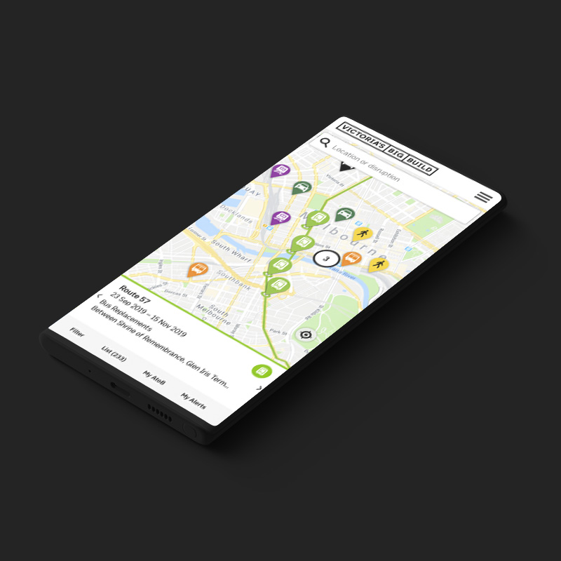
Victoria Big Build Disruptions Web App
Victoria Big Build is responsible for the upgrades and improvements of Victoria's transport system. This includes projects like the new Metro Tunnels, Level crossing removals and freeway links. With many of these projects in place, the construction results with many Victorians faced with delays and disruptions on their daily commute, leading to frustration and a negative perception on the projects.
To improve the commute of Victrians and minimise disruption, Victoria Big Build were after a solution to help inform Victorians on upcoming works that would affect their travel times.
-- The Process
Discovery
Stakeholder Workshops
Documentation Analysis
User Interviews
User Testing
Market Research
Analysis
Personas
User Journeys
Ideate
Brainstorming Workshops
LoFi Wireframes
HiFi Wireframes
Design
Visual Design
Atomic Design Library
Validate
Prototypes testing
-- The Tools
-- Research
When working on government based projects, there are many stakeholders and legal restrictions involved. It was important to understand the percption of all stakeholders, in regards to the existing solutions that were in place and the issues they faced when informing commuters on upcoming disruptions. This involved stakeholder meetings, retrospectives and journey mapping on existing solutions. These workshops allowed stakeholders to voice their opinions whilst better aligning the team on the key issues and the direction ahead.
Many research reports already conducted by the client and existing data analysis was reviewed, which helped clearly define the target demographic as well as validate known issues and uncover new ones. Further competitor research was conducted into PTV, Tram Tracker, Google Maps, as well as other travel apps in cities across the world, giving insight into the tools and solutions used to solve similar problems Vic Big Build was trying to solve.
We moved forward with engaging the target demographic, by running interviews and qualitative testing with users. The information gained from these sessions again helped to validate many issues, but also quashed others that were made by stakeholder, and helped to allign both stakeholders and user needs.
-- Define
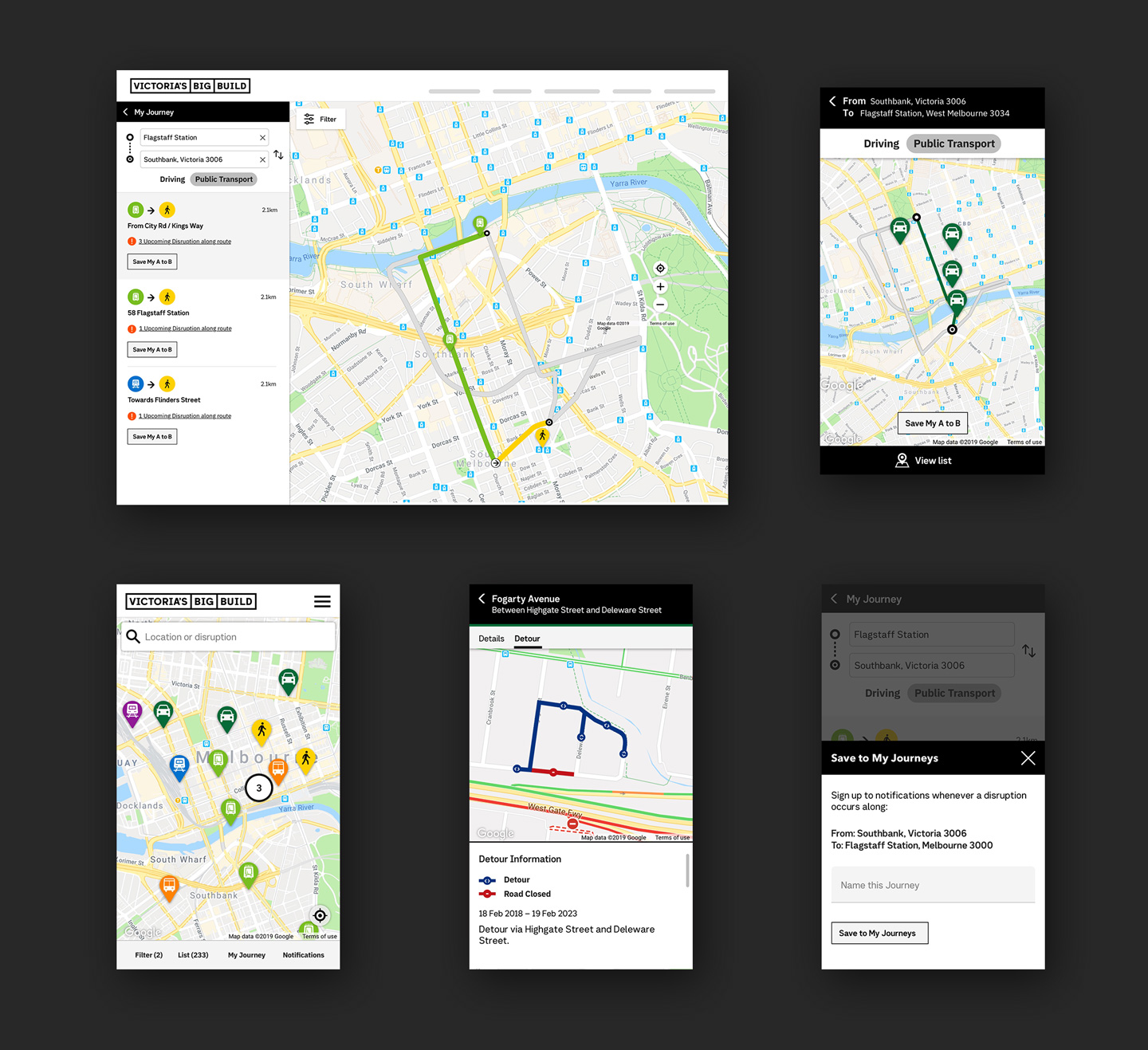
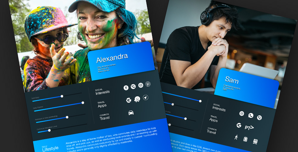
During the define stage, we took all of the information gathered through Primary and secondary research and used it to clearly define 6 different commuter groups. They included students, young professionals, business travelers, suburban drivers, retirees, regional commuters. Using these user types, journey maps and user flows were created to define how different commuters are affected and respond to disruptions.
Through our discovery stage, we found that existing solutions such as metro and road signage, as well as radio updates, were mostly effective. Issues in metro areas arised with commuters based on the sheer number of signage, desensitising them to the messaging. This resulted to many users finding out disruptions too late, then using apps such as google maps and PTV app to find alternate journeys, adding extra time to their commute.
-- Concepting a solution
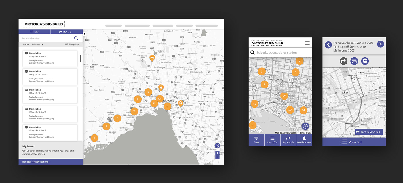
The initial discovery uncovered many issues which we tackled during a brainstorming workshop with the team. This defined the directions of the app. Instead of attempting to compete with existing well known and trusted apps, we wanted to create a tool that allowed commuters to be informed about disruptions based on their regular commutes and common places, well before the project works began. The tool was designed for users to sign up to comms, that informs them on works that are upcoming around locations such as their work, home or along their frequent journeys. The updates would also inform users on alternate routes and detours to take.
Being map based, the web app would naturally require a strong level of engagement from the user. That's why it was important to replicate an experience the audience was already familiar with. Apps such as Google Maps, Apple, Waze and PTV app were referenced regularly for inspiration, when designing layouts and features, so that the user faced less of a learning curve.
Before diving too far into a solution, we went through many stages of wireframing and testing. From paper prototype to high fidelity wireframe, we conducted both quantitative and qualitative tests. Through this process, we were able to validate and improve the solution to meet user and stakeholder needs, without over investing time and effort into features that may not have worked. Whilst desiging for a blue sky solution, the development was phased using MoSCoW method in order to deliver an MVP product.
-- Visual design
AA accessibility standards were a requirement for this project. In order to improve recognition to commuters, colour schemes from PTV were used to align different travel types. Designs leveraged Material UI in order to be efficient during development. After establishing a digital style guide, the UI designs were implemented across a series of design sprints, first establishing templates, followed by each separate component. The final designs were supplied to the developer team using Zeplin with a companion functional spec.