Collaborate. iterate. elevate.
— Featured Case Studies
— About
Passionate about crafting exceptional digital experiences that transform businesses and delight users. With 18+ years in the field, I’ve had the privilege of driving innovation across Fortune 500 tech giants, government agencies, and cutting-edge marketing firms.
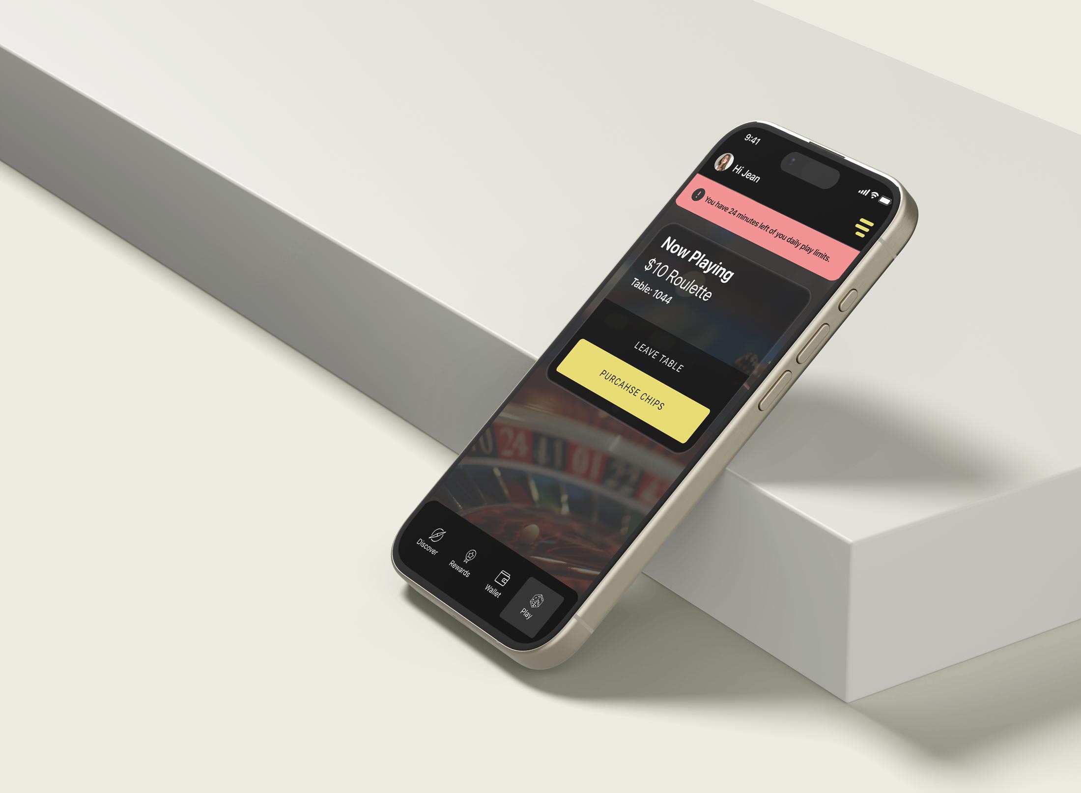
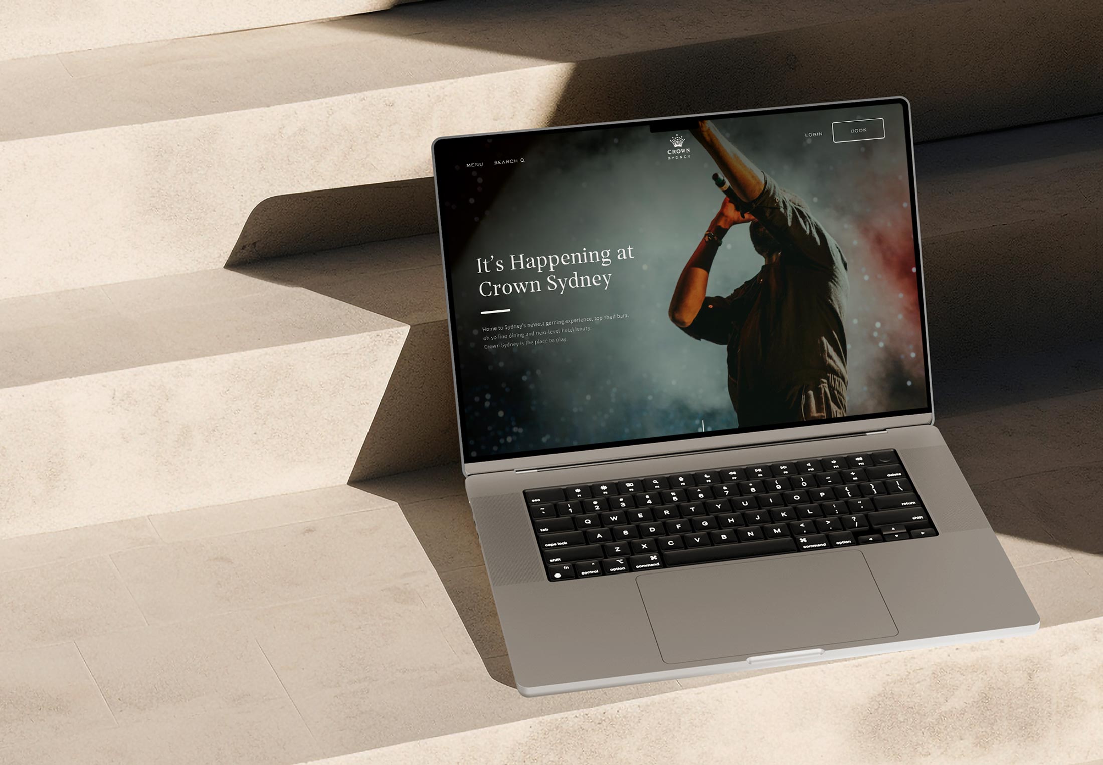
My journey has led me through transformative projects across diverse industries. From pioneering FinTech UX/CX innovations at Crown Resorts to orchestrating design operations for Atlassian’s 600+ design team, I’ve consistently turned complex challenges into elegant, user-centred solutions. Along the way, I’ve led digital transformations for government agencies, reimagined customer experiences for major banks, and created immersive digital installations for global entertainment brands.
What drives me:
- Building and mentoring high-performing design teams
- Bridging the gap between user needs and business objectives
- Pushing the boundaries of what’s possible in digital experiences
- Fostering cultures of curiosity, creativity, and continuous learning
Whether it’s pioneering FinTech innovations, reimagining government services, or creating immersive AR experiences, I thrive on projects that challenge the status quo and make a real impact.
Always eager to connect with fellow design enthusiasts, innovators, and anyone passionate about creating digital experiences that truly resonate with users.
Let’s chat!