UX / UI Designer
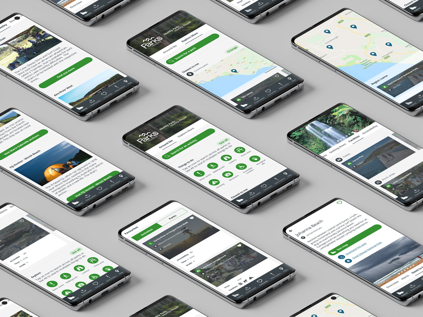
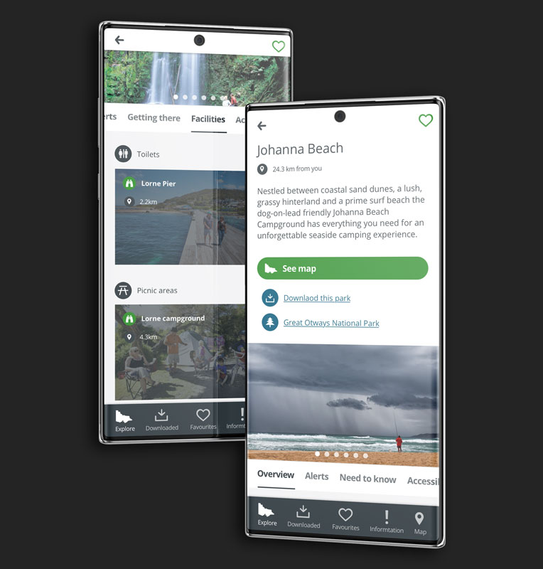
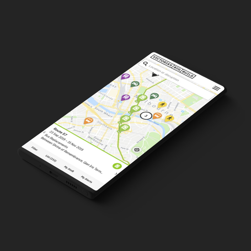
Parks Victoria Mobile App
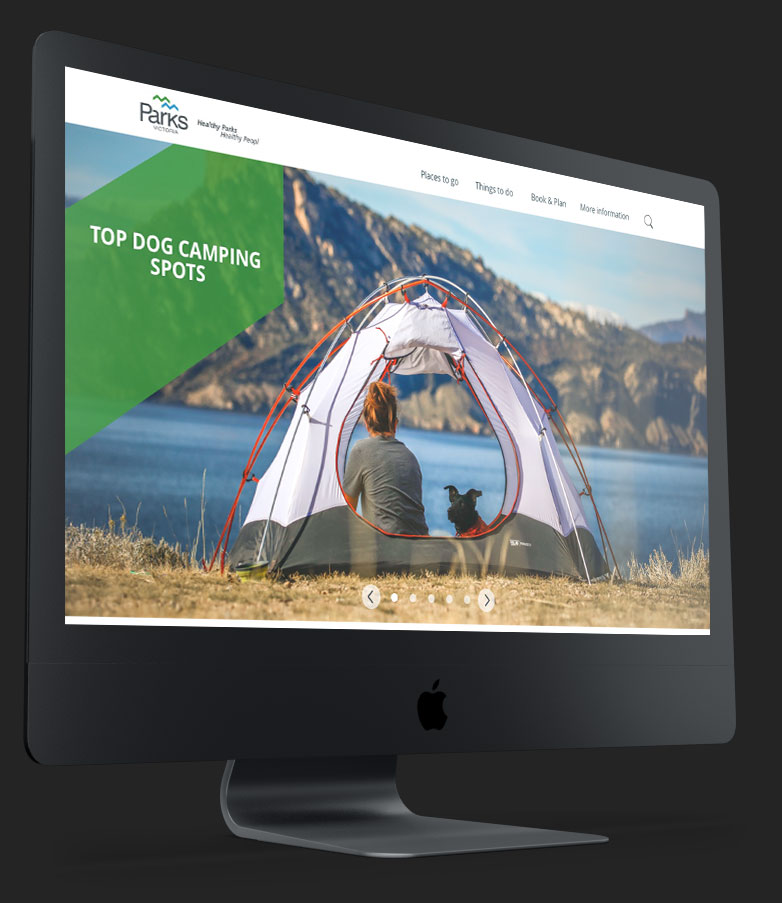
Parks Victoria manages 18% of the land in Victoria, which is made up of national, state, marine and metropolitain parks. They welcome over 106 million visits per year, from both local and international visitors. Whilst exploring one of these amazing locations, it can be dificult to navigate and find locations and amaneties when you need them. With a website designed around planning your trip, a companion mobile app was the strategic direction to allow users to engage with Parks Victoria whilst at a location.
-- The Process
Discovery
Stakeholder interviews
Market Research
Analysis
User data analysis
User Journeys
Landscape Analysis
Ideate
Brainstorming Workshops
LoFi Wireframes
HiFi Wireframes
Design
Visual Design
Prototypes
Validate
Qualitative Testing
Quantitative Testing
-- The Tools

-- The Approach
Much discovery had already been conducted for the main website and with a strong desire to launch, the App took a lean startup approach. An initial review on already conducted research, as well as some landscape analysis, gave us enough information to start designing and prototyping a product that we could cycle through a series of tests and reviews, before launching an MVP product.
-- Understanding the problmes
I initially started reviewing the existing user research and data at hand, which enabled me to identify themes for visitors whilst at a park. This review was followed by a landscape analysis of other similar apps trying to achieve the same or similar goals around the world.
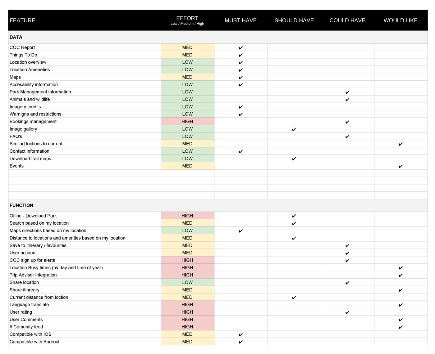
The initial research helped define some initial problems and ideas to start with before reconveigning with the stakeholders. At this point we started to ideate with them, by running a brainstorm / painstorming workshop. Here we created a shopping list of features and content that aligned with the business goals and met the user needs. Using the MoSCoW method, we could all clearly align and prioritise on what would be required for a MVP release of the App.
-- Sketcing out a solution
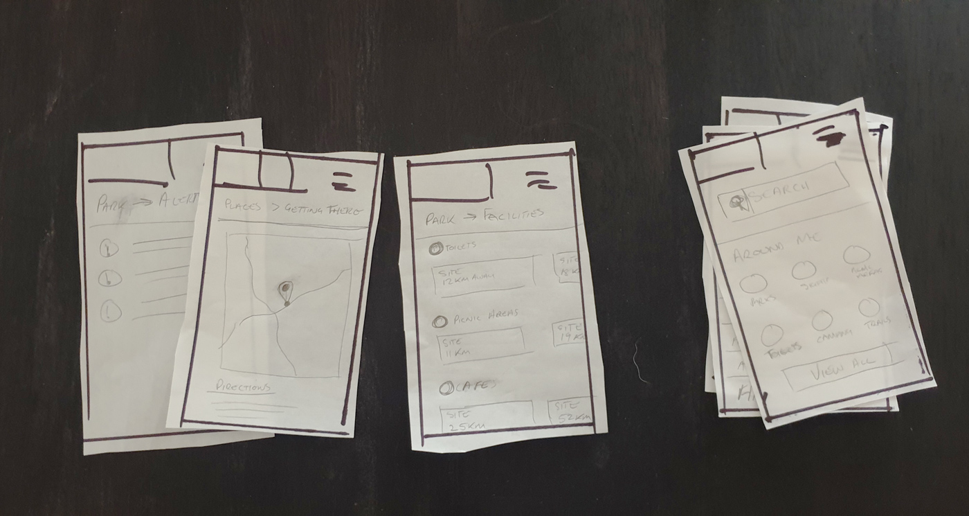
With research at hand, the next phase involved working closely with a content strategist and defining the direction for the App. This involved initial sketches of the templates required, content needed within each template and map out how users would flow through the information throughout these templates. In the end, we had a user flow and a series of paper wireframes, which we initially used to test internally.
-- Blueprinting a solution
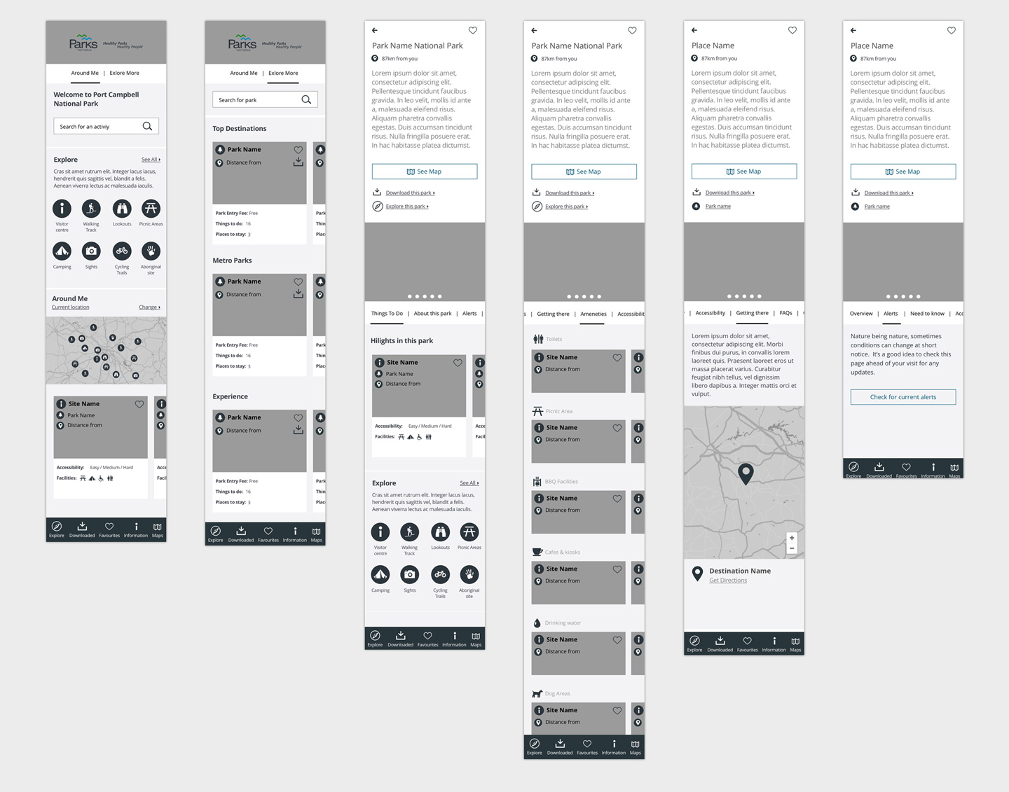
Following the initial paper prototypes, the qualitative feedback was taken on board through the next stage of high fidelity wireframing. Here we further defined detailed functionality, content flow and layouts, that were then tested again, but this time with the users, capturing both qualitative both quantitative data. This stage allowed us to A/B test solutions and validate assumptions on how easy the product was to use and if users found information relevant.
-- Design to inform
Implementing on the existing UI kit created for the website, the designs took on a more functional direction. Clean designs following a strict grid, allowed users to skim through information quickly, allowing them to spend more time in nature and less time on their phone.